Doqura
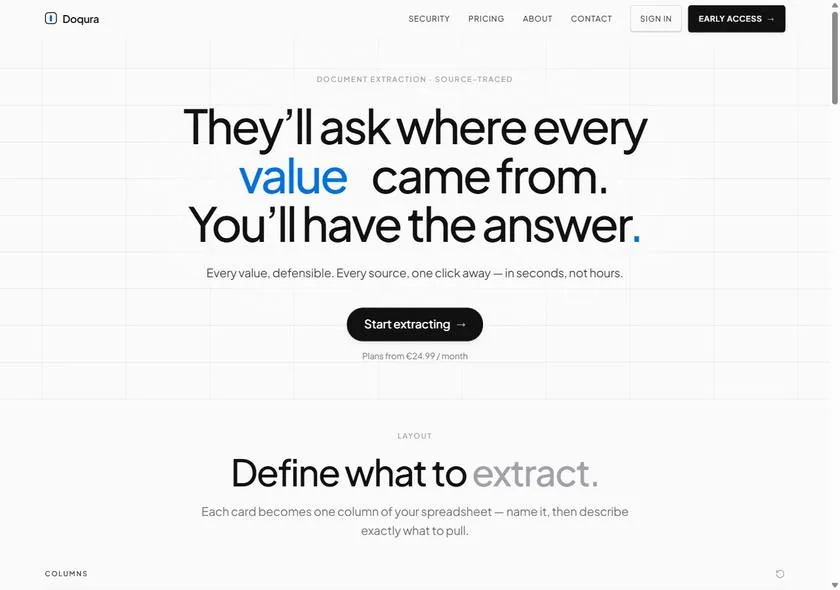
A document-extraction product, given a landing page that earns trust before anyone starts a trial.
The brief I set myself
Software buyers are sceptical for a living. With a product that extracts values from documents, every claim has to feel defensible — “where did that number come from?” is the question the whole category lives or dies on.
So Doqura is a demonstration of a different discipline entirely: a landing page where clarity is the design. No mood, no flourish for its own sake — just structure that makes a technical product feel trustworthy in ten seconds.
The approach
A precise grid, engineered type, and a strict information hierarchy: what it does, why you can trust it, what it costs, how to start. Every section answers the next objection in the buyer’s head, in the order they think of it.
It’s the deliberate opposite of my Noir build. Where a restaurant sells a feeling, a product sells confidence — and confidence is built from order, evidence and restraint.
The craft, in detail
- 01A real grid. Consistent columns and rhythm so the page reads as engineered — the same quality signal the product itself promises.
- 02Type that means business. Clean, confident, high-legibility type; emphasis used only where a claim needs weight.
- 03Conversion-first structure. Value → proof → price → start, so a serious buyer never has to scroll back to find the next answer.
- 04Fast and accessible. Hand-coded and lightweight, because a slow, clumsy site quietly undermines a product that’s selling precision.