Noir
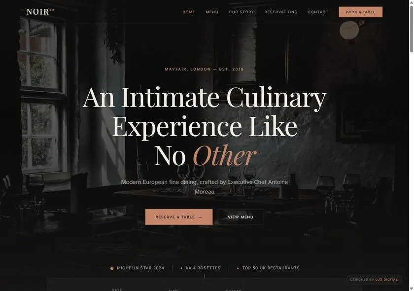
A fine-dining room in Mayfair, rebuilt as a website that feels like the table you’re about to book.
The brief I set myself
Most restaurant websites are a menu PDF, a phone number, and a stock photo of a plate. They tell you the food exists. They don’t make you want to be there on Friday.
Noir is a demonstration of the opposite: a site that sells the evening, not just the menu. The question I designed around — what does walking into this room feel like, and can a homepage do that before you’ve booked?
The approach
Everything leans into atmosphere. A near-black room, candlelit warmth, and a high-contrast serif that carries the drama of a printed menu. The reservation is never more than a glance away — the whole page is built to move a curious visitor to “book a table” without ever feeling like a funnel.
It’s the deliberate opposite of my Doqura build: where that one is bright, precise and engineered, Noir is dim, tactile and indulgent. Same craft, opposite world — which is the point.
The craft, in detail
- 01Mood as a system. A dark palette with warm candle tones, used consistently so the site feels like one continuous room rather than a set of pages.
- 02Editorial typography. A high-contrast serif at display size does the emotional work; restrained body type keeps it legible and calm.
- 03Reservation-first flow. “Book a table” is always in reach, so intent never has to hunt for the action.
- 04Fast and hand-coded. No page builder, no heavy theme — it loads quickly even with the moody imagery, because performance is part of feeling premium.